Visual content is on the rise. Just take a look at how many apps and social media outlets there are today with the purpose of simply sharing photos and images. Not too many blog posts are without published without an image or two either. There doesn’t seem to be much slowing down in sight. Even Facebook saw an opportunity to get in on the deal with a $1 billion purchase of Instagram.
Why are images and visual content so important? Consider how many articles, websites, profiles, advertisements, etc., you breeze through in a day. It is a lot to take in. Information is everywhere, and we have access to just about anything we would like to know about. We are practically swimming in a sea of information. So what attracts your attention and engages you? Visual content; including colors, fonts and arrangements of these.
This visual content, in our fast-paced, multitasking world, is what many times leads to the decision of continuing to view or read more. Even then, time is valuable, and making sure viewers and readers retain what you are trying to express is important. Or in the famous words of my Pops, “Get to the point.”
Alright, alright, I’ll get to the point too.
When it comes to sharing information, even technical information, in the form of visual content, what’s the best way in doing so today?
Infographs.
Ah yes, the infograph. I’ve found many people stating when they claim the first infograph was used, or who even invented it, but if we consider what an infograph is, “a way of presenting information, data, or knowledge with the use of visual tools” according to wisegeek.com, I think credit really should be given to the early cave dwellers. Truly, even a simply story drawn with stick people, showing where to find food, would be considered an infograph.
Today, infographs are found in abundance online, used as data visualization tools for sharing studies, tips, ideas, etc. The CornerPost Pinterest boards are full of great marketing infographs (see some here) and are pretty handy references. Why are they such powerful tools? Well consider again how many different pieces of information you view a day, how much information is thrown at you, and how much time you take to actually read that information and retain it? And again, what draws the most attention?…visuals.
If infographs are so valuable as digital images found shared across the web, how else can you use infographs in marketing to share messages, stories or data?
Here is our five uses of infographs outside of a digital image, along with some great examples we have come across.
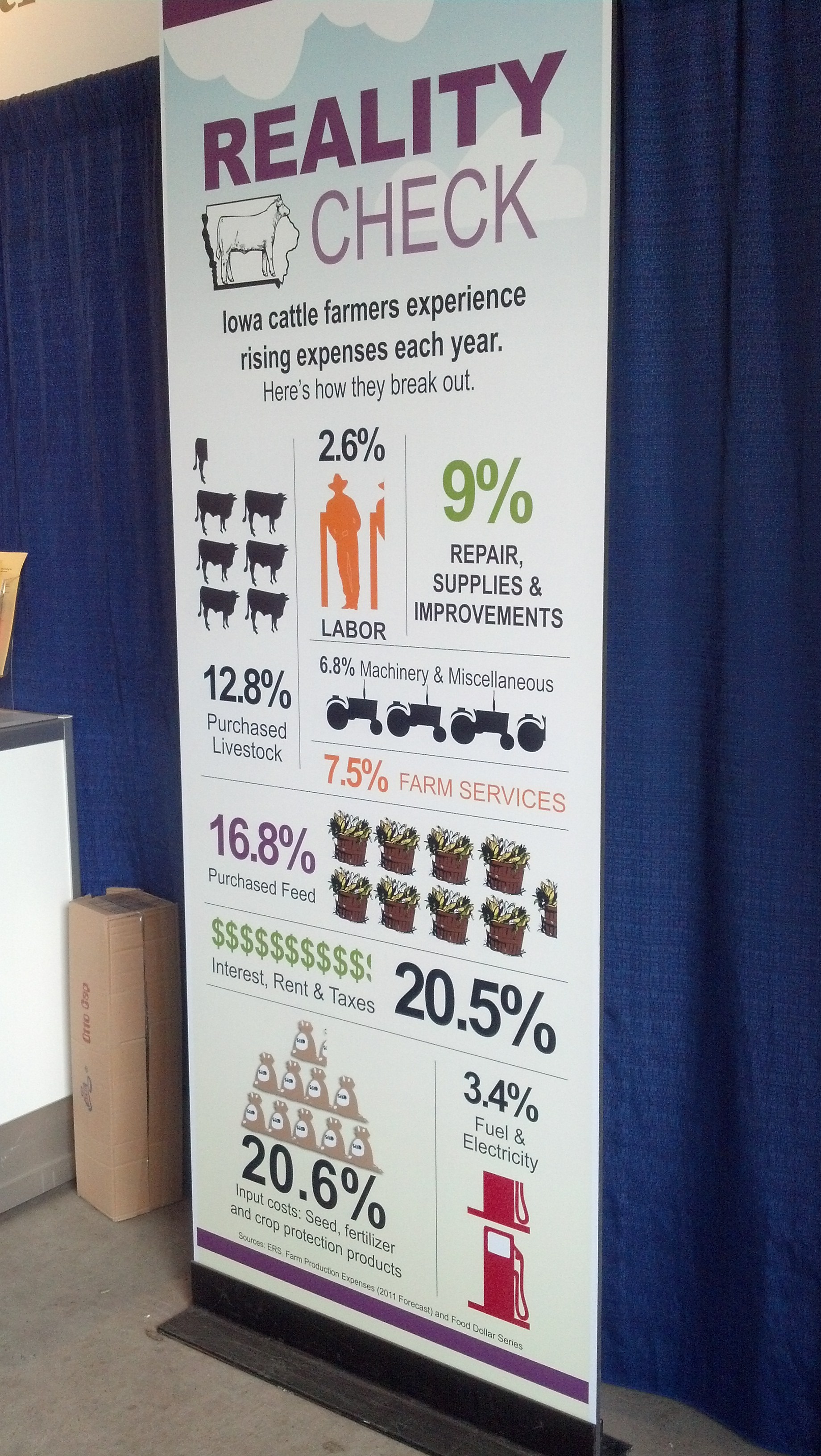
a. Trade show and exhibit booths
You are already spending dollars on the creation of booth materials to attract attention, so why not use that space as an infograph as well? Those few extra seconds a person stands at that banner viewing the infograph could potentially lead to a one-on-one conversation.
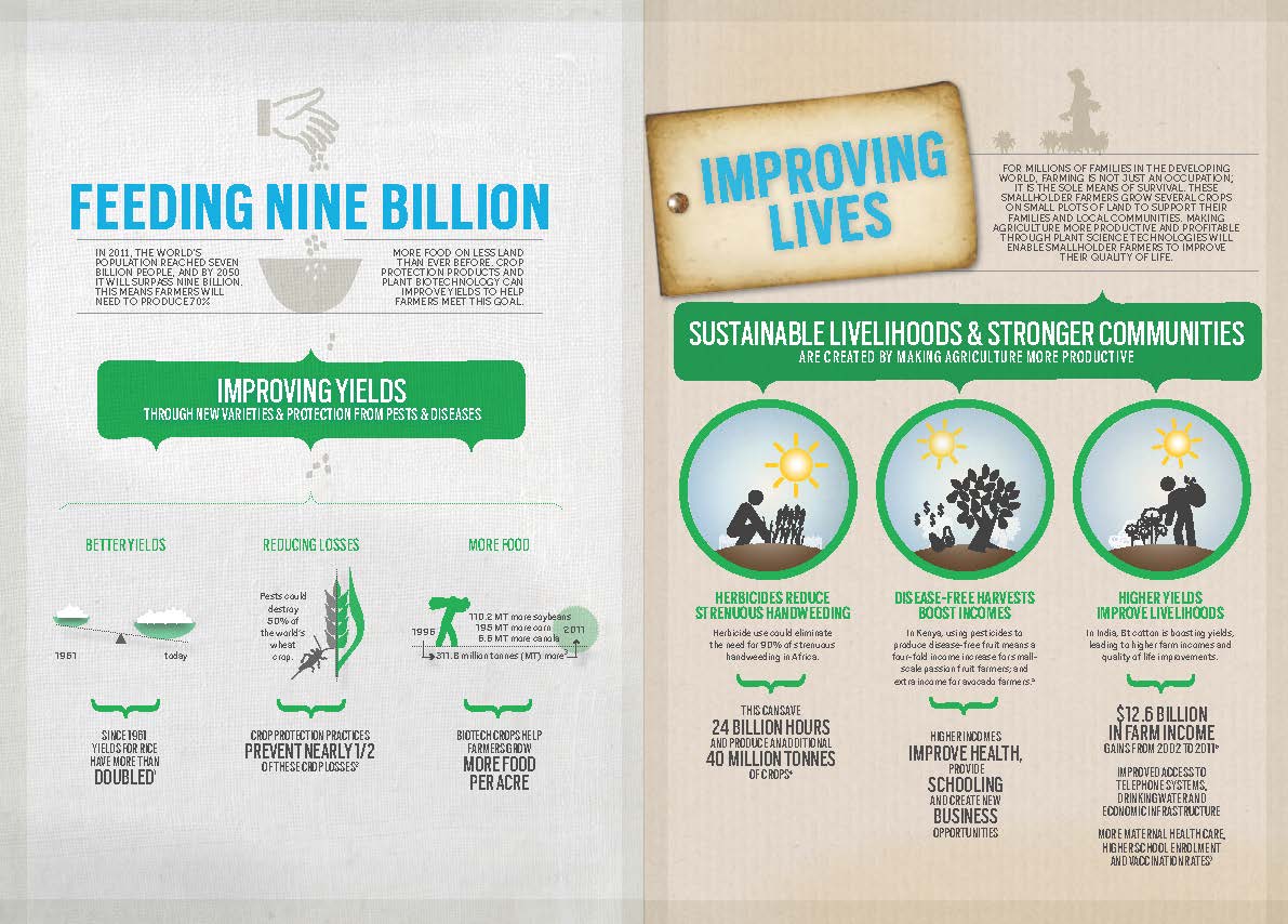
b. Literature, pamphlets or marketing collateral
A lot of dollars go into great company literature, but if you have a piece that only has a few seconds to not only impress, but educate or inform as well, try using an infograph style of designing the information. Here’s a great example from CropLife. You can view the full version of this example here. CropLife-Feeding Nine Billion
c. Video & presentations
These are not only some of my favorite videos, but they can also be the most powerful. Some types of information are hard to display in a video, but with the simple graphics, numbers, short words and symbols, you can educate and inform very effectively. Add the right music and simple animation, and you’ve created some emotion as well for the viewer.
For presentations, you can’t hear enough how less is more in terms of text. So why not use an infographic approach to educate and increase the ability for the audience to retain your message?
d. Outdoor signage & billboards
This is some very valuable space you purchase, but you’ve got a message that has only an average of 7 seconds to be read according to OutdoorBillboard.com. This seems pretty long to me for someone going 65 mph, but this also depends on the type of outdoor signage. The example below, which would be viewed by pedestrians, has packed in a lot of information, but each pass by this signage would bring more chances to catch a new fact.

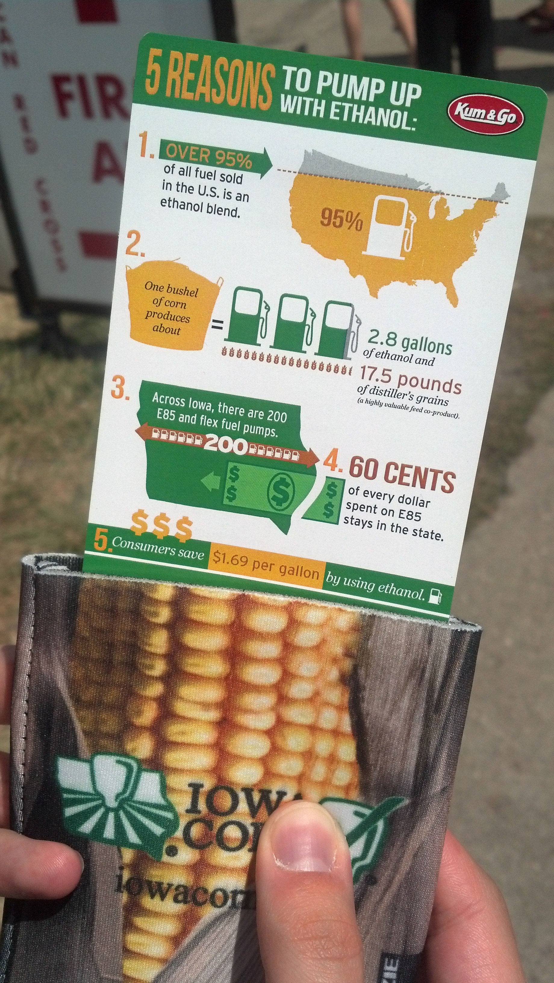
e. Coupons & mailings
Similar to brochures or literature, coupons and mailings can become even more beneficial to sharing your message with the use of infographs. Now, understand that the recipients really only care about that discount or promotional offer, but valuable space should be used wisely. What better way than with an infograph. Here’s one of the best ones I have seen. Not only did this piece include coupons from the Iowa Corn Promotion Board for discounts on fuel (located on unviewable bottom portion), but it also used this space to educate the recipient on ethanol production. Oh, and it came with a fabulous koozie!
There you have it. Now start brainstorming where you would like to see your message be stronger, and let us know. We’ll be happy to work with you on creating infographs to represent your message, and place them in the most advantageous places.
Here are some creative infographs to get your wheels turning.